Sunday, November 1, 2015

Week 10 -Outside of Class

Outside of Class


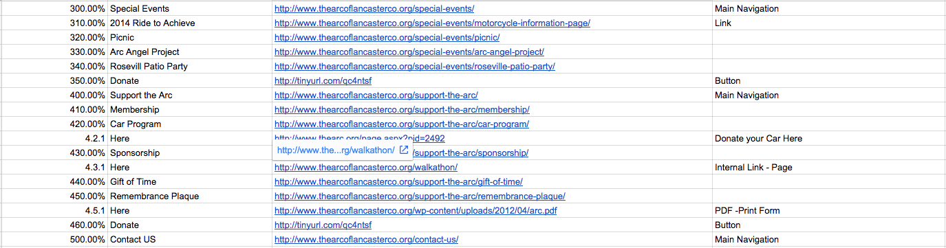
Finished Content/Quantitative Audit: The Arc of Lancaster County


Overall Research Findings:

  • Sidebar hosts interchanging content per page. 
  • The bulleted points are represented as sub-navigational links that would work more effectively as dropdown menus under the main navigational tabs. 
  • Excess amount of external links
  • Inconsistency in labeling information. 
  • Pages contain little information. Most informational pages are external PDF pages. 
  • Broken Links
  • No contact information listed; unless you want to read the last line of the webpage. 


Final Artifact Decision: For the final artifact to showcase all my research and process. I will hand code in HTML and CSS a long scrolling webpage that I will design myself. The design of the webpage will be focused on a simplistic and clean approach. The design will reflect the overall research during the webpage testing.

UX Project Plan: 


5 Methods:

  1. Content Inventory / Quantitative Audit
  2. Card Sorting
  3. Proto-Personas
  4. Heuristic Markup
  5. Project Brief

Week 10B

WEDNESDAY

In Class

This class period was used for in-class work time to correct and find common themes or problems during our content inventory.

Research Findings
  • No drop down menus under main navigations 
  • Once you click on a tab (ex: About Us) the information you would of seen in a sub navigation under the main navigation is found on the sidebar. Also, this sub navigation can only be viewed on the sidebar of each page. This was similar across all main navigation tabs.
  • The confusing part of this navigational path is that the sidebar changes every time except for the information about events and the donation button. 
  • The donate button is listed multiple times on all of the pages. This become very excessive.
  • Every image that is a link, brings you to the image at full size. 
  • There is an inconsistency with image links. Some links are external link to webpages or just full sized images.
  • Some of the links in the sidebar on the home page are not labeled the same way that they are on the "Special Events" sidebar at the top.
  • Links for the "Special Events" tab don't have the same page heading title.
  • Some of the sidebar links take part of the work or phrase, instead of the entire title.
  • There are duplicate links for external links such as the "thearc.org". The links are just labeled differently on different pages making it inconsistent.
  • There was a lot of broken links.
  • Not all information was on each main landing page. A user would need to go to the sub-pages to read the information. This would be hidden information. 


Wednesday, October 28, 2015

Week 10A

MONDAY


* I was absent

Homework

Content Audit

For the time being I choose to work on The Arc of Lancaster website because my professor gave me the go on this website but it is not definite and I'm not 100% set on using this website for my project. The content audit is an organized list of the content that is found on your currently organizations website. The benefits of using this audit tactic is being able to reference the content when developing new content and gives a clear understanding of the website.


What Methods will you be using.

These are not final but possible methods I will be using.
  • Content Patterns
  • UX Questionnaire
  • Project plan - organizing the length of time.
  • Project Brief
  • Strategy Workshop - Trying and testing it out.

Readings

Method 12: Content Patterns - pages 144-147

In a content inventory, you interact with the service or product and attempt to create a representative sampling of all the information, assets, and functionality of the product. You will be able to get a greater understanding of the structure and layout of information. By creating content patterns you are less comprehensive than a traditional content inventory. You will show recurring patterns of content and functionality that exist and how they are structures. On average it takes 2-4 hours to review the patterns, 1-2 hours to create a content map and 1-2 hours to summarize key findings. This is mostly used when you want to get a deeper understanding of the structure, information and is often conducted at the beginning of the project. By finding the patterns you must list all the elements that come together to make up a unit of content. Once all the findings are complete you can use this to analysis the observations and improve the product.

Content Strategy Reading

Depending on how you capture your audit is based on the business objectives that reflect your product or service. There are different types of audits that can be captures to create your content. A quantitative audit is an index of the content on your site, it's the easiest think to do when you're trying to find and understand the content. This will benefit those who have a limited timeframe. For those who are working with larger websites make conduct a "rolling content inventory. This is an ongoing process and shouldn't be something you allocate in the first two weeks of the redesign. Partial content inventories tend to be more cost-effective than trying to achieve a perfect on right away. The audit will ask questions such as what content do you have, how is it organized, who creates its, and where does it live? The content is based off the major sections of your site. This can be broken up into sections based on the objectives on the website. You should record everything that is listed on the site such as PDFs, videos, forms, functional pages and so on. Numbering your sections will better organize the information in order to review and react on the findings. It's important to record who creates the audits as well as hosting the content for everyone to view. 


Sunday, October 25, 2015

Week 9 - Outside of Class

Outside of Class

User Experience Website 

Below are the three poorly organized website I could possibly use for my User Experience project. Trying to find website was very difficult, since a lot of non-profit organizations in Lancaster already have an organized website or don't have a website at all.

1. The Arc of Lancaster - Lancaster County

* First Choice - It's possible to figure out the purpose of the site but it becomes very difficult when prompted a question and then trying to find the information. For example "Where can I volunteer?" but as you go through the website there is no section for volunteering and if there is, I haven't found it yet.

  • What is the site for? 
    • The purpose of the site is unclear at first glance. The general information listed shows events, programs, services and how to support the arc. There is a lot of content included under each page but I believe the site host events going on to promote and protect the rights of people with mental and physical disabilities. 
  • What is the main purpose?
    • I believe the main purpose is to host events but there is so many options to choose from its unclear why they started this website. In general overview, I think families come together to support people with disabilities. I want to believe it's family oriented but the website doesn't seem very welcoming. 
  • Are there too many links/choices?
    • There are some pages that have way too many links and choices. The information isn't listed by hierarchy and seems kind of random. 
  • Do you find yourself struggling?
    • I find myself struggling, knowing what to look at and where to find the information. There are a lot of links to click on and the sidebar acts as a content page that lists different information a new page pops up. This becomes very confusing because most sidebars stay consistent and this one has way too much content and changes all the time. I also struggle on the contact page because there is nothing listed.


2. Pleasant View Retirement Community


* Second Choice - This is my second choice because the location of the retirement community is outside of Lancaster but I find myself struggling to answer the following questions.
  • What is the site for?
    • Based on the title of the website, I can tell its a retirement community for senior living. The site talks about the campus and living options you have in their community. As for how they laid out the information and exactly where to find it becomes difficult.
  • What is the main purpose?
    • I believe the main purpose of the website is to host information for senior living and provide all the options there is if you were to stay at Pleasant View. 
  • Are there too many links/choices?
    • There is a lot of valuable information on this website but the layout is confusing. There are three different navigational options. One nav bar at the top right, one center nav bar under the logo and a side bar. The way the website is organized is all over the place. 
  • Do you find yourself struggling?
    • I find my self struggling when I use the 3 different nav bars. The sidebar is most confusing because it changes every time I click on a new link. This causing a lot of hidden links that are not visible at first glance. This would work better if it was organized with several sub nav bars under the main one. 


3. Fulton Theatre

* Third Choice 
  • What is the site for?
    • The purpose of this website is to host the different movie and productions that goes on at the Fulton Theatre in downtown Lancaster. I had prior knowledge of the theatre but I don't think the home page of the website does the Fulton Theatre justice because the mission of the theatre isn't giving right away. 
  • What is the main purpose?
    • List the available performances as well as purchase tickets for those events.
  • Are there too many links/choices?
    • I believe the nav bar has an excessive amount of options that leads to several other options. I feel as if the options could be paired down. I'm not exactly sure how I would change it but there just seems like too many options to click on. 
  • Do you find yourself struggling?
    • I find myself struggling if I was given a task to find a certain item in the website but the information on each page individually is laid out in an organized manner. 


Readings

Smashing Magazine Article: What is User Experience Design? 
Overview, Tools and Resources


The goal in the production process is being able to answer all the questions a user/visitor may ask when viewing a website. User experience explains how a person feels when interacting with a technology system. The system could be a website, application, desktop software, etc. The designer will try to study and evaluate how the users feel about a system based on the ease of use, perception of value, utility, efficiency in performing tasks and so forth. This field of study is fairly new and researchers are constantly finding new disciplines to understand user experience. Before designers would create user-centered design and if they liked it then they were done but this is not the case anymore. A designer must now take into consideration all the boundaries that could interfere with how the user works the system. It's important to understand the planning process of UX design because a company could spend more money fixing the problems down the road if they don't attract the right users rather than spending money to plan, research and analysis the final product. It's important to remember that UX design is not a one size fits all but rather understanding the system as a human being and that everyone is different. The situation may change for each company. A company can not determine the success of a product based on page views, and conversion rates because they would be assuming the product works. Some of the tasks and techniques of a UX designer make use the following deliverables.
  • A/B Testing - Comparing the effectiveness and quality of the experience of different users on different interfaces.
  • User Surveys
  • Wireframes and Prototypes - based on findings layout different examples
  • User Flows 
  • Storytelling
  • Design Patterns
  • User Profiles and Personas
  • Content Inventory
  • Content Style Guides
  • Tools of the Trade
  • A/B Testing software
  • Content Inventory Software
UX Project Plan - pages 90-95

The purpose of a UX project plan is to think about the broader project's timeline and how your going to conduct UX activities. This may take a few weeks to accomplish. UX plans are unfamiliar but can benefit the process and final deliverables. When it is appropriate to use UX plans is at the beginning of your project, once you have completed preliminary research, and when your confident in your project goals. The goals should speak to the business and the behavioral change you hope to see when your through your work. A project brief will satisfy this step. By laying out the activities, duration, inputs, outputs, and who needs to be involved in this process you will understand the plan. By creating a schedule you can master your plan and be able to stay on track. Create tables with estimates and assumptions of the project. Over estimate the time length of each task to stay on track. 

Chapter 5: Planning and Discovery Methods
 
Chapter 5 focuses on the planning and discovery methods and design needs to understand when setting up your website for a long term success. The chapter covers UX questionnaires, UX project plan, listening tours, opportunity workshops, project briefs, and strategy workshop. Below is an overview of each method. When organizing UX questionnaires its import to know the products clear purpose and track the challenges in the organizational structure. Based on the challenges the designer focuses the questions are trouble areas, the questions will be the foundation of the project brief. UX project plan is not the same as an overall project plan. This definition is also listed above in UX Project Plan - pages 90-96. Listening Tour allows your team to set up information and learn from your colleagues on what matters most. This can also be described as the stakeholder's goals. This can be used when your new to a company and your trying to understand the big picture. Based on your questions you will find out the budget, who will engineer the product, who will market the project, and see the different opportunities the project or product will provide. In an overview the last three methods prioritize the information from a UX point of view to focus and discuss all the strengths, weaknesses, themes, user needs, business needs, goals and expectations from the project. It's important to have a plan and organize your thoughts between interviewing people because you will have more success when prioritizing your goals.

Chapter 6: Research Methods (Similar explanation in Week 6A)

Chapter 6 focuses on the different types of research methods that can be completed for user testing. 
  • Learning plan is centered around the user mindset and it is a way to get the user by face-to-face communication, server log datas and web intercept surveys. 
  • Guerilla User Research understands how the user behaves by performing goals by asking open ended questions to see the thought process of the target uses. 
  • Proto-Personas are larger in concept than a persona that thinks empathetically about consumers goals, needs and challenges. It is an unclear picture of the target audience that focuses on the needs, behaviors, motivations, quotes and over of the user. 
  • Heuristic Markup is the beginning to the end of the experience. This is an overview evaluation of the recording process by recording the emotions of the user. 
  • Comparative assessment is the envision and expectations for new user experience clear areas, content, design, features, functionality, flow, strengths, weaknesses, and opportunities. In the final outcome it will summarize the findings or guidelines.


Friday, October 23, 2015

Week 9B

WEDNESDAY


Final Project : User Testing - Artifact


At the beginning of class, each student presented their artifacts that they designed. For my final critique I had small groups give me feedback on corrections and adjustments I could make on my book. From their comments I was told to change. 
  • On pg.3 & Table of Contents - Spelling error "Intension should be "Intention"
  • On pg. 3 - try to bring last work from last sentence back over to 1st paragraph gets confusing stating out in the 2nd paragraph. 
  • On pg. 6 - Under time length, it should be "depends on how long" (get rid of "of")
  • On pages 11-12 - very text heavy
  • On pg. 14 - Quoting yourself isn't right for book format, try using on attributed quote from a professional or reading.
  • On pg. 16 - Text is filling unnecessary space
  • On pg. 27 - Shouldn't quote yourself. Same comment as pg. 14
  • Point of gaze is a great way to show a complex idea but your blues could be more opaque, it's too dark. 
  • Page numbers at bottom of page are very large. Consider shrinking them down.
  • Consider keep the "key" on each image that has gaze tracking. 
  • Blues on black background kind of blend together. 
  • On pages 5-6 - lines of text are not exactly aligned between the left and right columns
  • Sometimes page number slightly go over yellow bar which is awkward, possibly get rid of yellow bar all together. 
  • Include page number on every page. 


Video

Nicolas Carr's "The Shallows" What the Internet is doing to our brains?"

Below are a few of the comments I took away from the video we watched in class. I really enjoyed watching this video because over the past year I have noticed that my concentration level as well as focusing on one task has become very difficult and at first I did not think it was caused from the Internet. After watching this video I downloaded the app called Lumosity which practices small tests like memory skills by using matching games to test and train your brain. 
  • By constantly using Google we lose the ability to concentrate and technology is changing the way we think.
  • Google has trained our brains to multi-task but we haven't been training our brains to contemplate or think more deeply into a conversation or subject matter.
  • We've been losing the attention span to engage in deeper conversations or critical thinking. 
  • Our brains will only evolve, depending on how technology evolves. 
  • Our patiences while performing tasks has decreased
  • We need to practice and train our brains by reading books that aren't on a nook. 

Project 3 - User Experience Design Process

For the third and final project over the next few weeks we will be finding poorly organized websites and constructing a new organizational structure for the website. A poorly organized website is not the same as a ugly website. The project will consist of taking photos, interviewing people, a writing segment and a final artifact. The purpose of this project is to understand the amount of research it takes to organize a website. Unfortunately, we will not be redesigning the website but we have the chance to create a designed artifact to showcase the final research. For example, someone could create a 11 x 17 poster, create an online article or hand coded webpage to showcase the research. 

The website we choose needs to be able to "tell a story". Some of the criteria we need to follow is the website we choose must be poorly organized, be able to talk to the website creators, and the website must be a non-profit organization in Lancaster, PA. 

When choosing a website, we must take into consideration the following:
  • Make sure the website is not too small
  • Preferably a local non-profit organization.
  • And had a difficultly answering the following questions.
    • What is the site for?
    • What is the main purpose?
    • Are there too many links/choices?
    • Do you find yourself struggling?

Tuesday, October 20, 2015

Week 9A

Fall Break No Class


See Week 8- Outside of Class for progress on project. 

Sunday, October 18, 2015

Week 8 - Outside of Class

Outside of Class


Over Fall Break, I spent a couple days finishing up my booklet. I focused on the questions instead of the users for my project. In order to sum up all the users eye tracking movement, I sketched out circles and lines to represent their gaze points. In my final ideation, I represented the points of gaze with blue circles. The larger the circle the larger the user read over that area. I also used the circles to represent a popular area where several users viewed. In my personal opinion I drew out what I thought was the easiest navigational path for each question. I drew the targeted area with a pink outline. Overall I thought my composition was working nicely and the shapes created in the design keeps eye movement throughout the spread. My intension was to keep the text to a minimum but it was difficult to finalize because I didn't want too long of book. I tried to incorporate as many photos as possible to keep the reader visually interested. It was very difficult to come up with suggestions because the website benefits the several different ways a user could take to get to a final result and because not one user thinks alike, a designer needs to consider all the possibilities. I personally had a lot of fun constructing my booklet although while I was taping the page together I ran into some problems. Once I moved a page slightly the pages shifted. I plan to use the book cutter at school to refine my edges.